
Table of Contents
- Understanding Visual Weight and Focal Points
- Measuring Your Wall Space and Planning Proportions
- Gallery Wall Layout Templates and Digital Planning Tools
- Best Gallery Wall Spacing and Margin Consistency
- How to Arrange Canvas Prints for Maximum Impact
- Mixing Art Styles in a Gallery Wall
- Selecting Your Colour Palette and Creating Cohesion
- Installation Techniques and Hanging Hardware
- Creating a Balanced Gallery Wall Layout: Common Mistakes to Avoid
- Frequently Asked Questions
Last Updated: September 25, 2026
Understanding Visual Weight and Focal Points
Visual weight refers to the perceived heaviness or prominence of an artwork on your wall. A painting with bold colours, large dimensions, or dramatic imagery carries more visual weight than a delicate sketch or pastel piece. Creating a balanced gallery wall layout means distributing this weight evenly across your space so no single area feels crowded or empty.
The focal point is the artwork that draws the eye first. In most rooms, this should be the largest or most visually striking piece. Establishing a clear focal point prevents your gallery from feeling chaotic. Once you've chosen your anchor piece, perhaps a striking Highland cow canvas or a bold landscape print, you can arrange smaller artworks around it to support rather than compete with that central focus.

Think of visual weight as a conversation between pieces. Heavy pieces need lighter companions. A large, vibrant painting paired with several small, muted prints creates equilibrium. Without this balance, your gallery wall risks looking haphazard rather than intentional.
Measuring Your Wall Space and Planning Proportions
Before hanging anything, measure your available wall space precisely. Use a tape measure to note the height and width in centimetres. This measurement becomes your canvas for planning a balanced gallery wall layout.
The rule of thumb: your gallery should occupy roughly 50-75% of your wall space. If your wall is 240 cm wide, aim for a gallery between 120-180 cm. This leaves breathing room on either side, preventing the arrangement from feeling cramped.
Proportion matters equally for individual pieces. If you're working with a 180 cm wide space, avoid placing a single 90 cm artwork dead centre, it splits the wall in half and kills balance. Instead, offset your largest piece and let smaller artworks fill the remaining space asymmetrically.
Measure the distance from floor to ceiling as well. Most designers recommend hanging artwork with its centre at eye level, approximately 152-157 cm from the floor. This creates a natural focal point that feels intuitive to viewers.
Gallery Wall Layout Templates and Digital Planning Tools
Before committing to holes in your wall, sketch your arrangement on paper or use digital tools to visualise your balanced gallery wall layout. Many homeowners find that arranging frames on the floor first, what designers call a floor layout, reveals spacing and alignment issues you'd otherwise miss during installation.
The Floor Layout Method
Measure your frames and cut paper templates to scale using cardboard or kraft paper. Tape these templates to your wall with painter's tape, then step back and assess the composition from different angles and distances. This low-risk approach lets you refine spacing and margin consistency without permanent commitment. The advantage: you see how light falls across your arrangement at different times of day, and you can test whether your eye-level reference point (152-157 cm from the floor) feels natural when you're actually standing in the room.
Digital Planning Tools and Apps
Digital planning has transformed this process. Apps that let you upload a photograph of your wall and overlay frame shapes help visualise your balanced gallery wall layout before any drilling begins. Some tools allow you to adjust frame sizes, spacing, and positioning until you're satisfied. The workflow typically involves:
- Photographing your wall straight-on in good natural light
- Uploading the image to the app
- Inputting your frame dimensions (width and height in centimetres)
- Dragging frame outlines across the digital wall image
- Adjusting spacing and alignment until the composition feels balanced
- Saving or printing the final layout as a reference during installation
This digital approach is particularly valuable for gallery walls above furniture, where you need to account for sightlines from seated eye level, or for non-standard spaces where floor layouts become impractical.
Gallery Wall Layout Templates
For those seeking structure, pre-designed gallery wall layout templates provide starting points: grid layouts (frames in neat rows), salon-style layouts (mixed sizes arranged organically), or linear arrangements (frames in a single horizontal or vertical line). Templates offer proven proportions, but your specific wall dimensions and artwork collection will require adjustments. A grid template designed for a 180 cm wall won't work unchanged on a 240 cm wall; you'll need to scale spacing proportionally.
Choosing Your Planning Method
Floor layouts work best when you have space to spread out and time to experiment. Digital tools suit those who prefer precision and want to visualise the final result before measuring the wall. Many designers use both: a digital mockup to test the concept, then a floor layout to confirm spacing feels right in the actual room.
The key insight most guides miss: digital planning tools and floor layouts aren't shortcuts, they're essential steps that prevent costly mistakes. Rooms with successful gallery walls almost always began with this planning phase. Skipping it in favour of measuring and drilling directly leads to misaligned frames, inconsistent spacing, and the frustration of patching holes and starting over.
Best Gallery Wall Spacing and Margin Consistency
Spacing between frames defines whether your gallery feels cohesive or scattered. Consistent margins create visual rhythm and balance. Most designers recommend 5-10 cm between frames for a tight, gallery-like feel, or 10-15 cm for a more relaxed, breathing arrangement.
Standard Spacing Principles
Margin consistency applies to edges as well. If your gallery sits above a sofa, maintain equal spacing from the sofa to your topmost frame. Symmetrical margins, equal distance on all sides, create formal balance. Asymmetrical margins, where spacing varies intentionally, can work beautifully when paired with offsetting visual weight elsewhere.
The alignment of frames matters as much as spacing. Align frames either by their centres, their tops, or their bottoms; choose one method and stick with it. Mixed alignment methods create visual confusion. A grid layout demands perfect alignment; a salon-style arrangement allows more flexibility but still benefits from intentional spacing logic.
Negative space, the empty wall between and around your frames, is as important as the artwork itself. Crowding frames together to fill every gap produces visual fatigue. Generous negative space lets each piece breathe and allows the eye to move through the arrangement comfortably.
Spacing in Non-Standard Spaces
Many homes feature architectural challenges that standard spacing rules don't address. These spaces require adapted approaches:
Staircases and Sloped Walls
Staircase walls are deceptively difficult because the wall height changes as you move along the staircase. A gallery that looks balanced at the bottom step may feel cramped at the top. Solution: use the staircase's natural rhythm as your guide. Rather than fighting the slope, arrange frames to follow it. Place your largest piece at the widest point (usually mid-staircase), then graduate to smaller pieces as the wall narrows. This approach makes the slope feel intentional rather than awkward. Maintain consistent spacing between frames even as the overall gallery tilts, this preserves visual harmony despite the architectural constraint.
Narrow Hallways
Hallways with limited width (under 150 cm) can't accommodate traditional gallery widths. Instead of a sprawling arrangement, create a vertical gallery: stack frames in a narrow column, maintaining 8-10 cm spacing vertically. This draws the eye upward, making the hallway feel taller. Alternatively, use a single-line horizontal arrangement at eye level, limiting yourself to 3-5 pieces in a row. The key is restraint; a crowded hallway gallery feels claustrophobic.
Corners and Alcoves
Corner spaces offer an opportunity to create a focal point that anchors a room. Place your largest or most visually striking piece at the corner's centre, then arrange smaller pieces on either side, maintaining symmetrical spacing. This approach makes the corner feel intentional rather than like a leftover space. For shallow alcoves (less than 60 cm deep), use a single large canvas or a tight cluster of 2-3 smaller pieces; spreading them across the alcove width makes them feel scattered.
Spaces with Windows or Doors
Walls interrupted by windows or doors require galleries that respect these interruptions rather than fight them. Treat the window or door as a visual anchor, similar to a focal point artwork. Arrange frames on either side, maintaining equal spacing from the window edge. Avoid placing frames directly above or below a window, as this creates visual competition. Instead, offset your gallery to one side of the window, creating an asymmetrical but intentional composition.
Measuring for Non-Standard Spaces
For any non-standard space, measure multiple points along the wall. On a staircase, measure wall height at the top, middle, and bottom steps. In a corner, measure from the corner point outward at 30 cm, 60 cm, and 90 cm intervals. These multiple measurements reveal how the space actually behaves, allowing you to plan a gallery that works with the architecture rather than against it.
Ben Ledi Print Media: Highland Cow Wall →
The principle underlying all non-standard spacing: consistency within the constraint matters more than adherence to the 5-15 cm rule. A hallway gallery with 8 cm spacing throughout feels balanced even though it's narrower than a standard gallery. A staircase arrangement that follows the slope feels intentional even though spacing varies in absolute terms. Adapt your spacing strategy to your space's unique geometry, then execute that strategy with precision.
How to Arrange Canvas Prints for Maximum Impact
Canvas prints offer particular advantages for gallery walls. Their uniform depth and clean edges create visual consistency, especially when mixing different sizes and subjects. A balanced gallery wall layout using canvas prints feels modern and intentional.
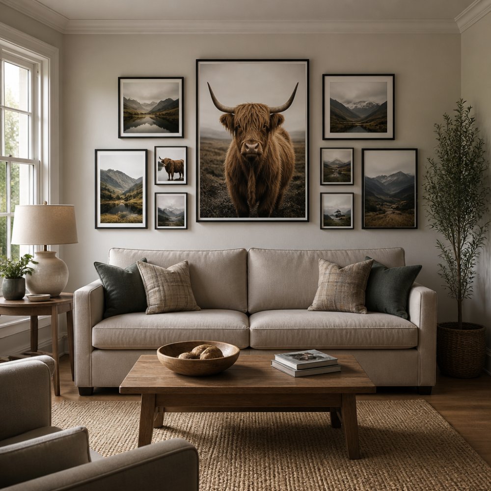
Start with your largest canvas as the anchor. Position it slightly off-centre rather than dead middle, this creates dynamic balance. Arrange smaller canvases around it, alternating between portrait and landscape orientations. This variation prevents monotony.
Consider the composition within each canvas. A canvas with a strong directional element (a stag looking left, a landscape with foreground and background depth) influences how you position it. Pair it with complementary pieces rather than competing subjects.
Ben Ledi Print Media's range of canvas wall art, from whimsical Highland cow designs to atmospheric landscape prints, works particularly well in gallery arrangements because each piece is crafted with composition in mind. The visual weight of a vibrant tartan-scarfed Highland cow balances beautifully against softer landscape prints when spacing and placement are thoughtful.

Hang your largest canvas first, then work outward. This prevents the common error of finishing with a gap that doesn't accommodate your remaining pieces. Ensure each canvas hangs level using a spirit level, even slight tilting disrupts the sense of intentional balance.
Mixing Art Styles in a Gallery Wall
Mixing styles creates visual interest, but inconsistent mixing feels chaotic. The trick is finding a coherent thread that ties disparate pieces together.
Colour palette is your strongest unifying force. A gallery mixing abstract prints, landscape photography, and animal artwork becomes cohesive when every piece shares a similar colour range. Warm earth tones bind together differently, as do cool blues and greys.
Subject matter can also provide cohesion. A gallery of animal-themed artwork, Highland cows, deer, birds, maintains consistency despite varying artistic styles. Similarly, a landscape-focused collection feels intentional even when mixing realistic and abstract interpretations.
Frame choice matters profoundly. Mixing frame styles works only when you limit yourself to 2-3 complementary finishes (natural wood and black metal, for example) applied consistently. Frames in five different styles fragment your arrangement, destroying balance.
The rule most designers follow: vary content but unify through colour, frame style, or subject matter. This approach lets you express personality whilst maintaining the sense of a curated, balanced gallery wall layout rather than a random collection.
Selecting Your Colour Palette and Creating Cohesion
Your colour palette determines whether your gallery feels intentional or accidental. Start by identifying the dominant colours in your room, wall paint, furniture, textiles. Your gallery should complement, not clash with, these existing colours.
A monochromatic approach uses varying shades of a single colour family. Creams, taupes, and warm whites create a serene, sophisticated gallery. This approach guarantees cohesion because the colour palette does the work for you.
Complementary colour schemes pair opposing hues, blues with oranges, greens with reds. This works beautifully for bold, energetic spaces but requires careful balance. Too many competing colours overwhelm; too few feel timid.
Analogous colour schemes use adjacent colours on the colour wheel, blues and greens, oranges and yellows. This creates harmony without monotony. Many successful gallery walls use analogous palettes because they feel naturally balanced.
Consider the matting and framing colours as part of your colour palette. White or cream matting expands visual space and works with nearly any artwork. Coloured matting adds sophistication but demands careful coordination with your overall scheme.
Installation Techniques and Hanging Hardware
Proper installation ensures your gallery remains balanced and secure. Begin by mapping every frame location on your wall using painter's tape and a spirit level. This dry run catches alignment errors before drilling.
Locate wall studs using a stud finder when possible. Hanging heavier canvases into studs prevents sagging and ensures longevity. For drywall alone, use appropriate anchors rated for your frame weight.
Picture wire and D-rings distribute weight across two points rather than one, improving stability. For lighter canvas prints, single hooks suffice, but ensure they're rated for the weight. A 3 kg canvas needs a hook rated for at least 5 kg.
Measure twice before drilling. Mark your drill points clearly. A small spirit level ensures your first frame hangs perfectly level, subsequent frames reference this anchor point. Use a tape measure to verify spacing between frames before drilling additional holes.
The most common installation error is hanging frames too high. Eye level remains your guide: the centre of your artwork should sit roughly 152-157 cm from the floor. Adjust downward if furniture sits beneath your gallery.
For renters, damage-free hanging options exist. Adhesive strips rated for canvas weight eliminate drilling entirely. These work best on clean, smooth walls and with lighter frames. Test them on a single small piece first to ensure they hold.
Creating a Balanced Gallery Wall Layout: Common Mistakes to Avoid
The biggest mistake is starting installation before planning. Holes in your wall are permanent; poor planning is expensive to correct. Spend time on your balanced gallery wall layout before touching a drill.
Inconsistent spacing between frames disrupts visual flow. Even small variations, one gap 8 cm, the next 12 cm, create a scattered impression. Measure and mark everything before hanging.
Mixing too many frame styles confuses the eye. Stick to 2-3 complementary finishes. Variety in artwork is good; variety in framing is usually not.
Ignoring the room's existing proportions creates disconnection. A massive gallery on a small wall overwhelms the space. A tiny gallery on a large wall disappears. Your arrangement should feel purposeful relative to the room.
Hanging artwork too high is nearly universal. Err toward lower rather than higher. Eye level, that 152-157 cm mark, should be your default reference point.
Overcrowding frames leaves no breathing room. Negative space isn't wasted space; it's essential to composition. Your balanced gallery wall layout needs white wall showing between and around pieces.
Finally, don't abandon the project halfway. Incomplete galleries look accidental. Commit to finishing your arrangement fully, even if that means spacing pieces further apart to work with fewer artworks initially.
Creating a balanced gallery wall layout transforms a blank wall into a focal point that reflects your aesthetic and personality. The process requires planning, precision, and restraint, but the result is a curated arrangement that feels intentional rather than random.
Ben Ledi Print Media's collection of handcrafted canvas prints provides an excellent foundation for gallery walls. From vibrant Highland cow artwork to atmospheric landscape prints, each piece is designed with composition and quality in mind. Browse the range of canvas wall art to find pieces that speak to your space, then apply these principles to arrange them with confidence. Your walls deserve artistry that matches the care you put into your home.
Frequently Asked Questions
What is the secret to a balanced gallery wall layout?
Balance comes from distributing visual weight evenly across your wall. This means mixing larger anchor pieces with smaller artworks, varying frame styles without clashing, and ensuring colour and composition don't cluster in one area. Use painter's tape to test your layout on the floor first, this prevents costly mistakes and lets you adjust spacing before making permanent marks.
How much space should be between frames on a gallery wall?
Aim for 5-10 centimetres between frames for a cohesive, professional look. Tighter spacing (5 cm) creates a salon-style, gallery feel; wider spacing (10 cm) suits modern, minimalist arrangements. Consistency matters more than the exact measurement. Use a tape measure and painter's tape to mark positions before hanging, ensuring uniform margins throughout your layout.
Can I mix different frame sizes and art styles in one gallery wall?
Yes, mixing frame sizes and styles creates visual interest and prevents monotony. The key is intentional pairing, don't scatter mismatches randomly. Group similar styles together, use a unifying colour palette, and balance portrait and landscape orientations. High-quality canvas prints like those from Ben Ledi Print Media work well alongside varied frames because the artwork's composition draws focus rather than frame uniformity.
What tools do I need to hang a gallery wall safely?
You'll need a level, tape measure, painter's tape, a pencil, appropriate hanging hardware (picture wire or hooks rated for your wall type), and a stud finder if hanging on plasterboard. Start by arranging your frames on the floor using painter's tape to mark positions, then transfer measurements to your wall. This method prevents drilling mistakes and ensures alignment before you commit to hanging.